The Context
Bulgari China’s CRM and Clienteling app (used by Client Advisors in-store) is complex, slow and doesn’t generate the expected revenue. Bulgari asks LVMH Digital team to improve the overall experience. As the project scope is big and we have limited time, we work as a UX trio (1 local UX and 2 from Europe team), splitting the work based on our skills. The project ran from November 2018 to April 2019.
Initial Research
Together with UXers and the Project Owner we list out the goals of the research phase:
Identify is the product has measured up to Bulgari KPIs
Uncover what product features are being used the most, least or not at all - and why
Understand what is most useful for the users and unmet needs
Understand on a visceral level the nuances of the brand ID
This is the research methods we agreed to use (I was responsible/more involved for the ones in bold):
Client Advisors Interview and Store Visits: empathise with end-user and understand the context
Stakeholder interviews: understand the nuance of the stakeholders
Experience evaluation: analyse the experience utilising parameters of usability and user interface heuristics
Analytics: what is happening right now (task completion speed, error rates, engagement rates on certain features)
Brand DNA Discovery: evaluating the heritage, materials, products old/new, demographics, competition
System comprehension (stock, product catalogue, inventory, meta data, etc.)
High level system map
The Client Advisors Interviews and Store Visits
I went to Shanghai to perform store visits and speak to Client Advisors about their experience. I also took the opportunity to better understand the particularities of the local end user’s situation (WeChat, Alipay/WechatPay, etc.).
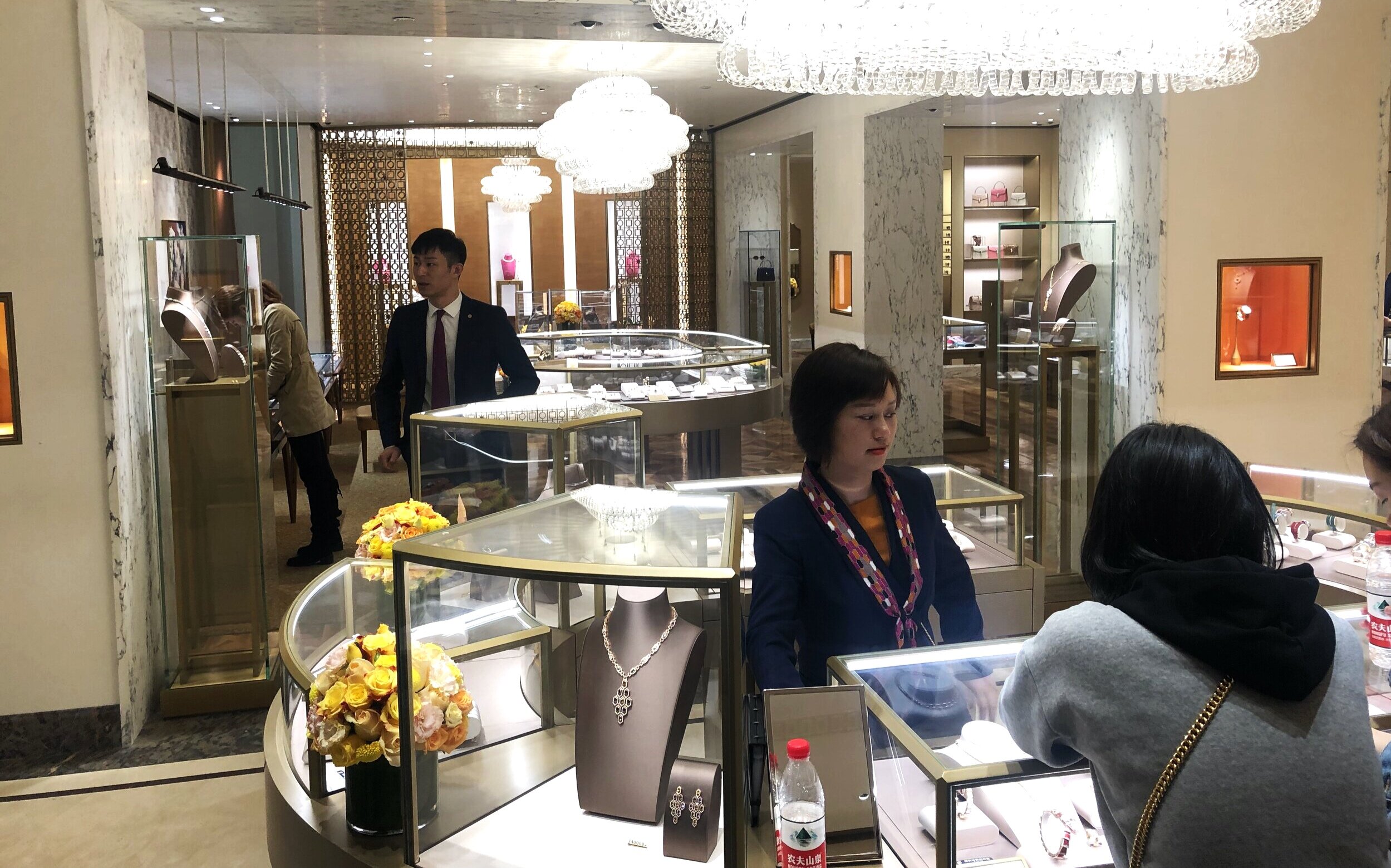
CAs in a store in Shanghai.
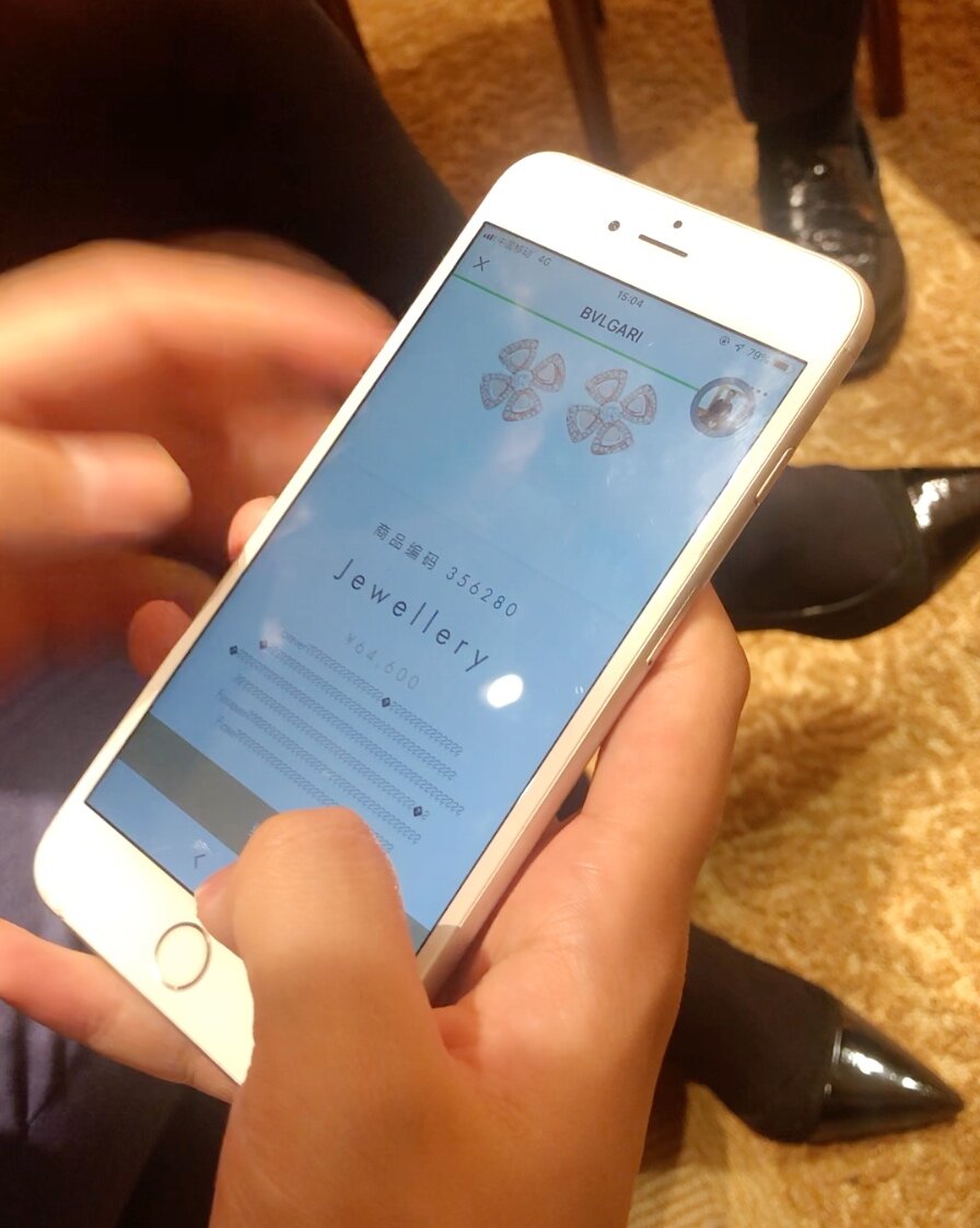
Client Advisors showing the “Selling Ceremony” during an interview.
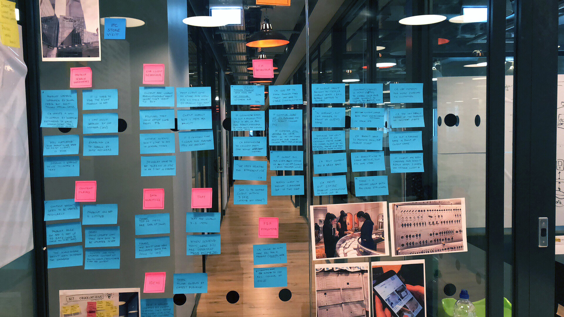
Store visits’ insights grouped by theme.
Presenting insights and the plan to client
Following an intense workshop session between UXers, we presented our insights and plan. We presented the parts we owned. Mine were Tray, Product Detail Page (PDP), O2O and Login.
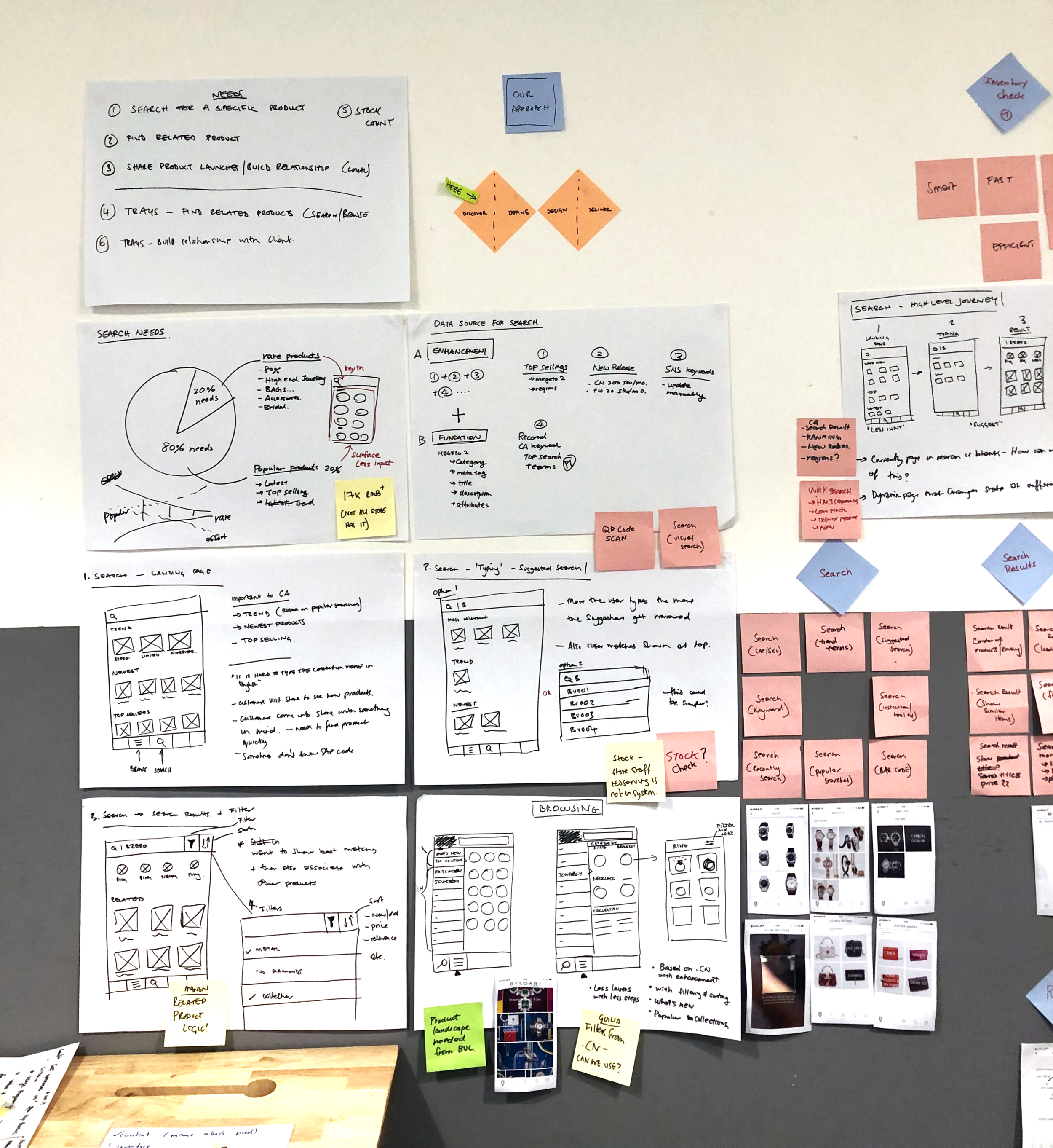
The first part of the presentation wall.
Focus on the Tray feature
The Tray feature is a digitised version of the physical tray SAs use to present jewellery pieces to clients.
Main insights were:
Most sales come from just 10% of products in Jewellery, Bags and occasionally Watches category
2 main target audiences: The ‘Loyals’ and the ‘Prospects’
Trays are often shared shortly after the client has visited the store and at least contain the product the person expressed an interest in
Chinese CAs find it hard to type the names of the collections (not used to Latin alphabet)
When a customer is in store, he/she usually has a specific product in mind
The Tray Principles
Based on CA insights and initial research, I summarised what the Tray principles should be:
IDENTIFY: CA must quickly find what the client wants and add it to a tray
RECOMMEND: CAs can suggest other products to a tray based on what they know about a specific client
PERSONAL TOUCH: CA can add personalised info, in-store pictures of the clients wearing the product, etc.
CONVERT: Client must easily pay. CA should see the record on her/his client history
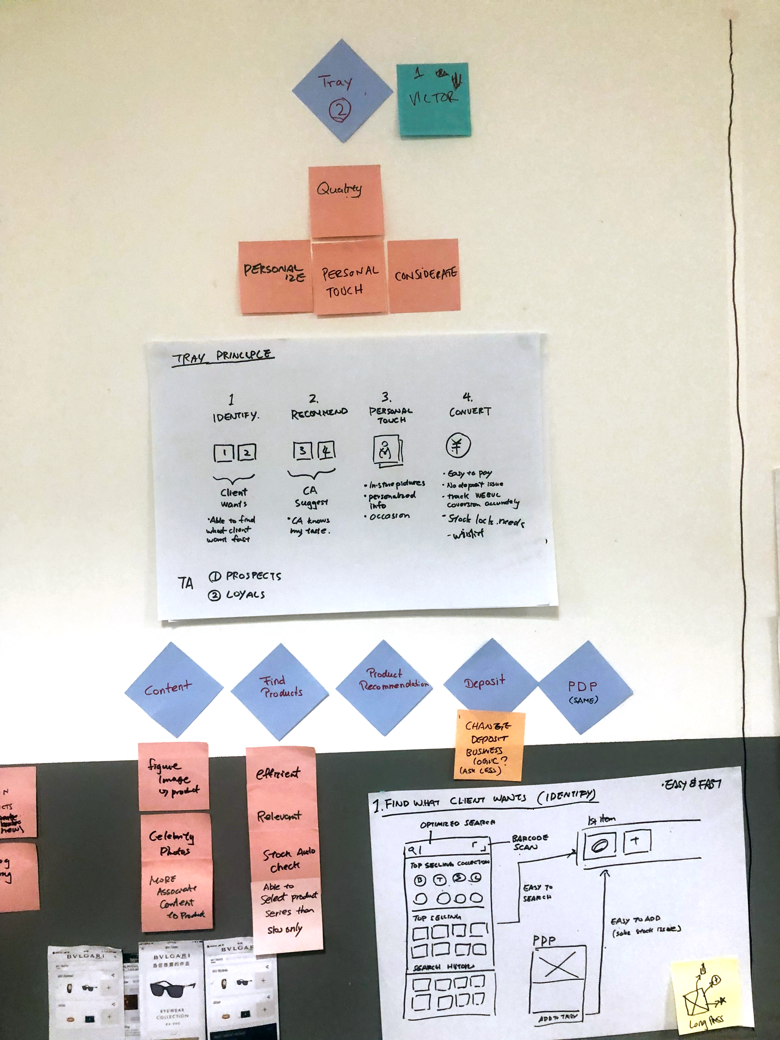
The Tray feature section on the presentation wall.
Stories and Features definition
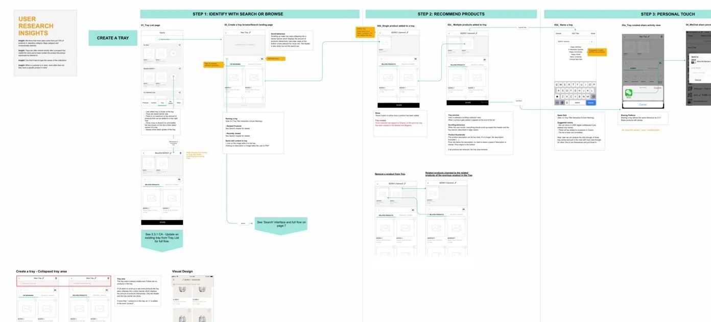
Based on theses principles I established stories and pages.
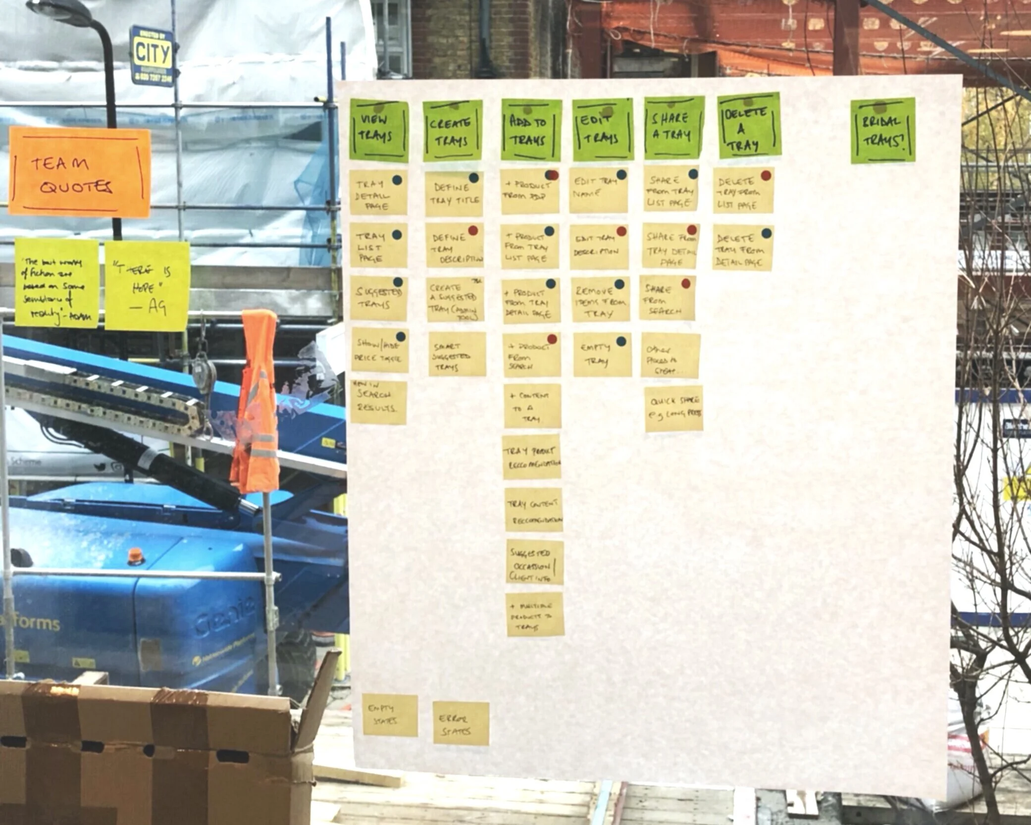
High definition wireframes
I then created the user flow and wireframes, constantly checking with both Front-end and Back-end Developers. I also presented the progress to the client and have her confirm each steps. Finally I shared everything with the UI Designer so he could work on the visual interface.
Tray section of the wireframes.